Logo Standards
The anchor has become synonymous with Hope and has roots in the college’s legacy. The metaphor originated from an observation the Rev. Van Raalte made regarding the Pioneer School: “This is my anchor of hope for this people in the future.”
Icon
 This anchor was adopted as a symbolic icon and appears in the center of the rose window,
and other stained glass in Dimnent Chapel. It is also the center of the college seal,
the name of the student newspaper, and adorns the lawn in front of Graves Hall.
This anchor was adopted as a symbolic icon and appears in the center of the rose window,
and other stained glass in Dimnent Chapel. It is also the center of the college seal,
the name of the student newspaper, and adorns the lawn in front of Graves Hall.
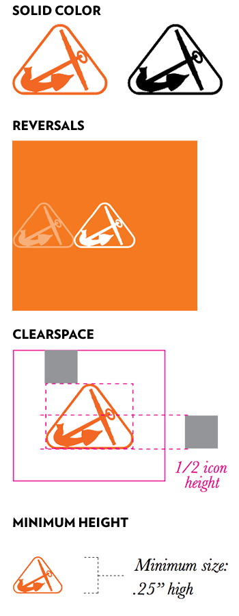
The logo’s anchor is drawn from the one in front of Graves Hall. The triangular border suggests the principles of mind, body, spirit associated with the college’s Christian heritage. The lines of the rounded triangle and anchor co-mingle.
Please note that this version of the anchor icon has been revised from the previous version. The difference is that the previous icon is a reversed version of the anchor that has a thin outline. The old version of this icon may no longer be used in any application.
- Icon Use Restrictions
-
 Permission must be obtained from Public Affairs and Marketing for use of the anchor
icon by itself.
Permission must be obtained from Public Affairs and Marketing for use of the anchor
icon by itself.- The anchor icon may be used when the context clearly references Hope College.
- The icon may only be used in Hope Orange (PMS 166) or Black River Black. No tints are permitted for use.
- Reversals of the icon may be used as long as the background color continues at least one icon width past the edge of the icon.
- The Hope logo must always have a clear space around it, where no other elements appear. Clearspace for both icons is half of the icon height for all sides.
- The mimimum size is based on legibility of the icon. The smallest size for the anchor icon is .25” high.
Logotype
This is the primary logo for Hope College. It consists of two parts: the name of the college, or logotype, and the anchor icon. Through consistent use of the Hope College logotype and editorial standards, Hope’s overall brand will be strengthened.

Primary Logo Configurations
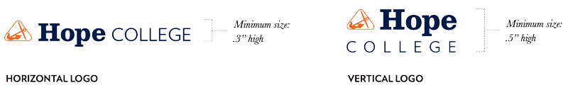
There are two logo configurations: horizontal and vertical. Horizontal is the preferred orientation for college communications. The vertical configuration may be used when space does not allow for the horizontal configuration.
Horizontal Configuration
![]() The spacing for the logo is based on x, which is equal to the width of the ‘O’ in
‘College’. The distance between the icon and the logotype and the two words of the
logotype is 1/2x. The the baseline of the logotype aligns with the bottom of the anchor
icon. The top of the ‘H’ in ‘Hope’ is exactly 1/4x from the top of the icon. The top
of the ‘C’ in ‘College’ lines up with the top of the lowercase letters in ‘Hope’.
These exact dimensions of spacing must be consistent in all applications of this logo
version.
The spacing for the logo is based on x, which is equal to the width of the ‘O’ in
‘College’. The distance between the icon and the logotype and the two words of the
logotype is 1/2x. The the baseline of the logotype aligns with the bottom of the anchor
icon. The top of the ‘H’ in ‘Hope’ is exactly 1/4x from the top of the icon. The top
of the ‘C’ in ‘College’ lines up with the top of the lowercase letters in ‘Hope’.
These exact dimensions of spacing must be consistent in all applications of this logo
version.
Vertical Configuration
This version may be used only if the layout does not permit use of the horizontal logo version.
![]() Notice that in this version, the ‘H’ in Hope is aligned with the top of the anchor
icon. The word ‘College’ also has more tracking between the letters to span the width
of the icon and the word ‘Hope’ at the top. The spacing between the icon and ‘Hope’
is consistent with the horizontal version of the logo. The spacing between the icon
and ‘Hope’ and the word ‘College’ is x.
Notice that in this version, the ‘H’ in Hope is aligned with the top of the anchor
icon. The word ‘College’ also has more tracking between the letters to span the width
of the icon and the word ‘Hope’ at the top. The spacing between the icon and ‘Hope’
is consistent with the horizontal version of the logo. The spacing between the icon
and ‘Hope’ and the word ‘College’ is x.
Logo Reproduction
- Scaling
-
The logo must be scaled proportionally when being resized.
- Clear Space
-
An area free of graphics must be maintained around the logo. The clear area for both horizontal and vertical configurations is the height of the “O” in “College.”

- Minimum Height
-
The minimum sizes for the logos are based on legibility of the icon. The smallest the icon size should be is .03" high (for horizontal logo) or 0.5" high (for vertical logo).
Color Specifications
- Two Colors (Primary Use)
-
The two colors of the logo are the primary Hope College colors. These colors apply to both the horizontal and vertical versions of the logo.

The two-color method should be used whenever possible on a white, cream, or other light-colored background (20% or less tint). The colors used are specific and restricted: the icon in Hope Orange (PMS 166), and the logotype in Hope Blue (PMS 289). This is done for brand recognition and consistency.
Under no circumstances may any other colors or tints of a color be used. These colors apply to all versions of the logo including special use.
- One Color and Black
-
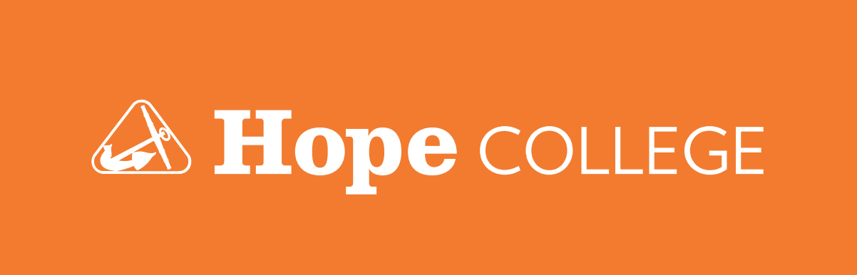
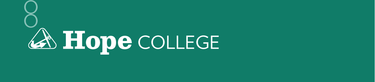
When the entire project is one color, a one color logo may be used. The acceptable colors are either Hope Orange (PMS 166) or Hope Blue (PMS 289). An all black version may be used for black and white projects. Always choose the color version that provides the greatest contrast and readability.


- Reversals
-
When reversing the logo out of a color background, be sure the logo is large enough for the wordmark and symbol to be read clearly, with sufficient contrast.
Reversed logo colors
The one color (white) logo may be reversed out of any primary or secondary color with the exception of PMS 106 (Cottage Yellow) and PMS 317 (Macatawa Mist). The two color (PMS 166 and white) logo may be reversed out of a PMS 289 (Hope Blue) background. This is the only background color permitted for use with this type of reversal.

Reversing out of a shape of color
When reversing out of a square or rectangular shape of color, the area of color for the logo reversal must be at least twice the clearspace for the logo. The logo may not be reversed out of any shape other than a square or rectangle.

Reversing out of a band of color
When using a band of color for logo reversal, it must span the entire width of the page layout. The clearspace for the logo when placed within a band of color must be at least twice the size of the letter “O” in the logo on top, bottom, and on each side.
- With Screens
-
The logo may appear in one or two colors when using a background of screened color.
- Only recommended tints of a color may be used as a background color.
- If the logo is placed on top of a background color screened at 20% or less, the logo must print in its solid color form.
- If the logo appears on a dark background color screen of 50% or more, the logo must be reversed.
- Logo usage against screens between 20% and 50% is not recommended.
- This applies for all logos within the system.
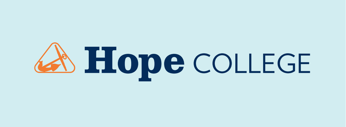
Two-Color Logo on a 20 Percent Screen of Color
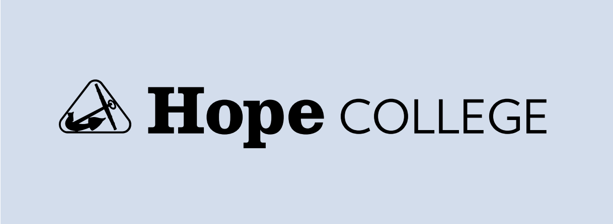
One-Color Logo on a 20 Percent Screen of Color

One-Color Logo (Black) on a 20 Percent Screen of Color
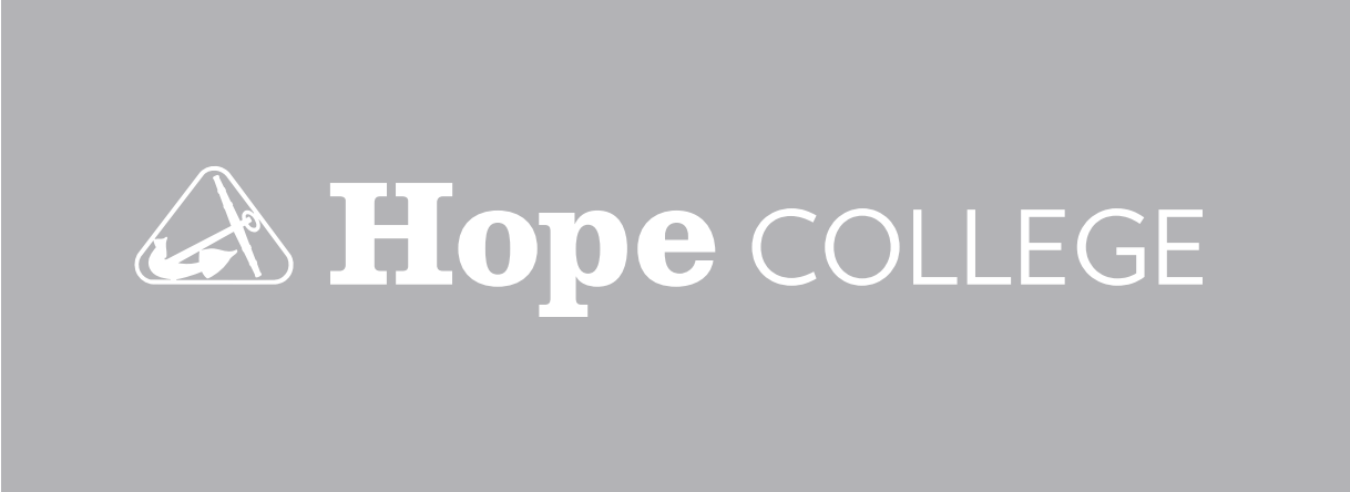
Reversed Logo on a 50 Percent Screen of Color
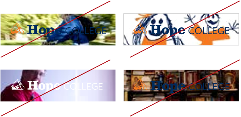
- With Photography
-
The logo must print in one or two colors or reverse in white. If the logo is placed on top of or reversed out of a photograph, the the background should provide distinct contrast so the logo is legible. Minimum clear space and size should apply.
- Unacceptable Usage
-
Do not use unacceptable colors for the entire logo or for parts of the logo. This includes unacceptable use of brand colors. Do not add any effects such as bevels or drop shadows to the logo.

Do not reverse the logo out of unacceptable colors. Do not reverse only part of the logo out of a color.
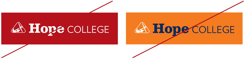
Do not reverse the logo out of a tint or screen lighter than 50 percent. Do not use a color or black logo on a tint or screen 50 percent or greater.

Do not place the logo on busy backgrounds of either photography or vector art. Do not reverse the logo out of a light-colored background. Do not put a color or black logo on a dark background, unless there is sufficient contrast.
Anderson-Werkman Center100 East 8th StreetSuite 110Holland, MI 49423
workP. 616.395.7860
marketing@hope.edu