Typography
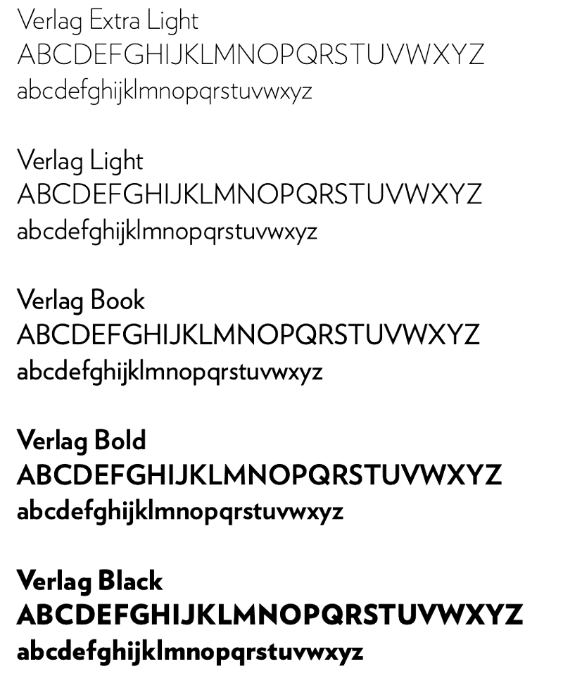
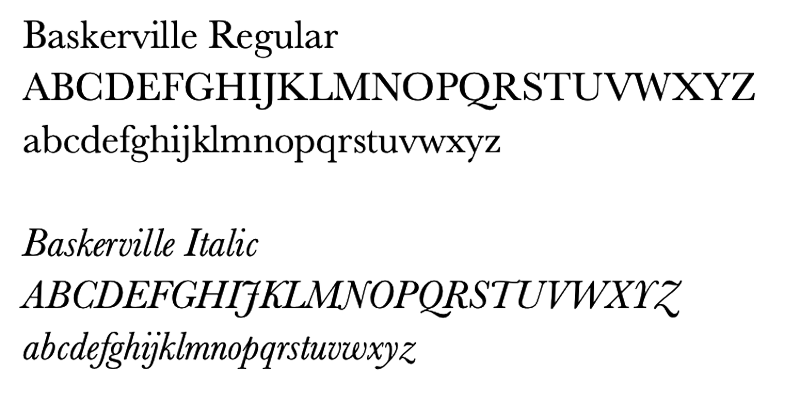
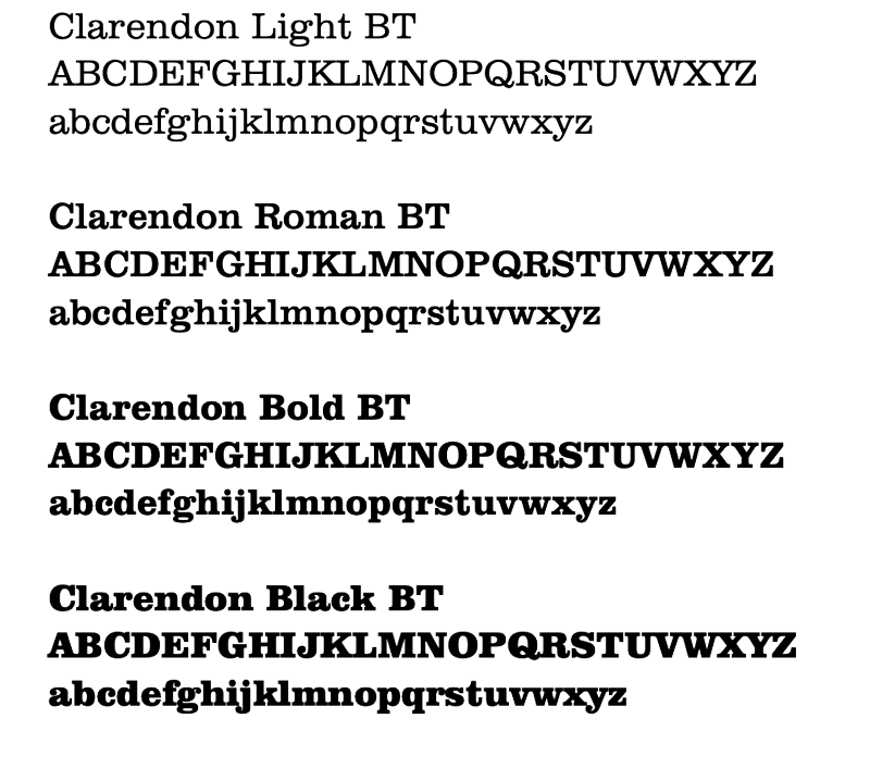
The typefaces for Hope College are Verlag, Baskerville and Clarendon.
Verlag is a sans serif, Baskerville is a serif and Clarendon is a slab serif.
Headlines, display and callout
The primary typeface for headline, subheads and callouts is Verlag. It can also be used as a display typeface. Verlag is a typeface based on Futura and other geometric type styles.

Body copy and callout
The primary typeface for body copy and text on letterhead is Baskerville. It can also be used as a callout. Baskerville is a serif typeface and provides balance to the more rigid geometric typeface.

Display only
The primary display typeface is Clarendon BT. Clarendon is a slab serif typeface. Its curvy lines are a nice contrast to sans serif typefaces and are a powerful choice for graphic typography. Display type refers to the use of type at large sizes.

- Substitute Fonts
-
 As the number of standard web fonts is limited and not all computers have the brand
fonts installed, two substitute typefaces have been chosen for Hope College: Arial
and Georgia. Arial is a sans serif substitute for Verlag and Georgia is a serif substitute
for Clarendon and Baskerville. These versions are to be used for digital applications
such as website, email, and e-news content and only when absolutely neccessary in
print when primary brand fonts are not available.
As the number of standard web fonts is limited and not all computers have the brand
fonts installed, two substitute typefaces have been chosen for Hope College: Arial
and Georgia. Arial is a sans serif substitute for Verlag and Georgia is a serif substitute
for Clarendon and Baskerville. These versions are to be used for digital applications
such as website, email, and e-news content and only when absolutely neccessary in
print when primary brand fonts are not available.For areas of a digital communication where typography might be used as a graphic element (such as a headline, call-out quote, drop capital), the official institutional typefaces are recommended for consistency. It is important to remember that when used this way, the type must be converted into a flat image such as a .jpg, .png, or .gif. This treatment is not recommended for body copy or other use where the information is critical.
Anderson-Werkman Center100 East 8th StreetSuite 110Holland, MI 49423
workP. 616.395.7860
marketing@hope.edu