Digital Signage
Our campus has over 50 digital signs, which are a great way to get the word out about your department's announcement or event.
The Basics
It's easy to make great-looking slides. You can use any image editor that you want; Adobe Photoshop, Adobe InDesign, Canva, Microsoft PowerPoint, Google Slides, Google Drawings... Even Microsoft Paint! As long as you end up with an image that looks good on a 4K TV, you'll be in business.

Guidelines
Remember that you only have a maximum of a couple of seconds to relay information to your users as they glance at your slide. Create a PNG or JPEG image that's 3840 × 2160px (or set your layout to "16:9 Widescreen" if you don't know what that means), and avoid vertical "poster-like" images.
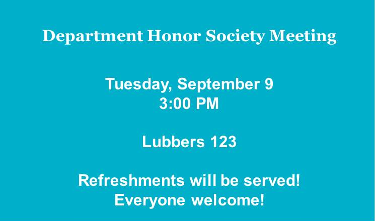
- Good Slide Design #1
-

- Use high-quality, clear, crisp photos that don't violate Hope College copyright policy.
- Unsplash.com and the Hope College digital asset library are great resources for photos.
- Write brief and to-the-point information.
- Select text color that is easy to read. Translucent white text boxes help to highlight important information on busier backgrounds.
- Select fonts that are clear and unfussy. Georgia and Arial are good choices.
- Try to use web addresses that are short and easy to remember.
- Good Slide Design #2
-

- Write brief and to-the-point information.
- Select text color that is easy to read.
- Select fonts that are clear and unfussy.
- Good Slide Design #3
-

- Write a message that is friendly and helpful.
- Select text color that is easy to read.
- Chose colors that complement the other colors on the page.
- Use photographs that complement the message, if necessary.
- Try to use web addresses that are short and easy to remember.
- Bad Slide Design #1
-

- Don’t choose photos/image that are low resolution/poor quality.
- Avoid using WordArt, 3-D text, bevels, shadows, etc. These text effects can make text
hard to
read on a monitor. - Keep information brief and choose readable fonts.
- Bad Slide Design #2
-

- Avoid using the Hope College logo. Your slide will likely be shown above a bottom bar that already has the Hope College logo on it.
- Do not modify logos by distorting them, adding new colors, adding shadows, bevels, etc. Do not place logos on busy backgrounds.
- Avoid using copyrighted or trademarked images on your slides.
- Avoid text colors or fonts that are hard to read on colored backgrounds.
- Bad Slide Design #3
-

- Check for spelling or grammatical errors. It’s very helpful to ask a coworker to review
your
slides before they are shown to the rest of campus. - Avoid long web addresses.
- Use clip art very sparingly and only when it adds necessary information to your message.
- Avoid hard to read fonts.
- Keep slides current so that events that have already occurred are not being publicized.
- Check for spelling or grammatical errors. It’s very helpful to ask a coworker to review
your
Submitting Your Slide
Because each department maintains content on their own respective screens, there is no place to submit your slide “campus-wide”. Most departments show many different feeds on their screen, but some only show their own content. The most common feed that departments subscribe to is the Student Formation Announcements feed. If you have a slide that you'd like to get on many screens, we would recommend starting there. Attach your image in an email to screens@hope.edu. From there, Student Formation will help you get it scheduled in the Student Formation Announcements feed.
Other departments may also be interested in adding your slide to their feed. For example, if your announcement or event relates to Athletics or the Bookstore, they may want to know about it! Consider sending your slide to them.
Digital Signage Platform
Hope College uses Concerto to manage our digital signage content. Click around and explore the various department announcement feeds at signs.hope.edu.
Anderson-Werkman Center100 East 8th StreetSuite 110Holland, MI 49423
workP. 616.395.7860
marketing@hope.eduTechnical Questions?
Contact CIT:616.395.7670
cit@hope.edu
Or submit a CIT work order.