Brand Identity
We live our brand.
Consciously living and sharing our brand identity is a powerful way for us to build and strengthen connections within the Hope College community. We are able to speak with a stronger, more recognizable voice when we all work together to be more thoughtful and consistent in the ways we connect messages with images. The following resources are available to help you create materials that consistently embody the Hope College brand.
- BRAND MESSAGING
-
Brand messages, which are based on our brand attributes, are the most important talking points or copy points when communicating with the Hope community. In choosing messages, we must keep in mind the audience and what they value. Think about Hope from their perspective.
Learn more about our brand messages and attributes
Brand Promise
Hope College inspires students to be fully alive in mind, body and spirit through an exceptional liberal arts education and a community grounded in a vibrant Christian faith.
- LOGOS
-
The primary logo for Hope College consists of two parts: the name of the college, or logotype, and the anchor icon. There are two configurations, horizontal and vertical. Horizontal is the preferred orientation for college communications. The vertical configuration may be used when space does not allow for the horizontal configuration.


- COLOR PALETTE
-
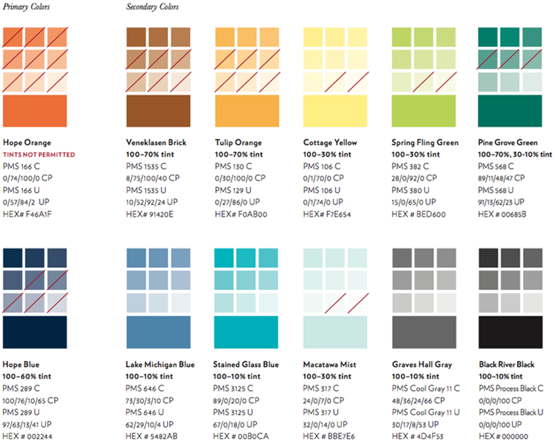
The Hope College color palette is made up of primary and secondary colors and tints.
Primary Colors
Hope Orange (PMS 166) and Hope Blue (PMS 289) are our primary brand colors. Hope Orange or Hope Blue must be present in every layout with the exception of black and white media. These colors can be used in a variety of elements, including but not limited to type, photography, texture, graphics and the logo.
Secondary Colors
The secondary color palette is based on colors in the rose window of Dimnent Chapel and also reference elements unique to the Hope experience. Secondary colors are an expansion of the color palette and should never be used without the presence of the primary brand colors.
Tints
Each color has a range of tints that may be used. The range was chosen based on several criteria: whether the tints hold true to the original color, whether the color is too light for use in print, and its overall aesthetic. Hope Orange is the only color that may not be used as a tint.
- FONTS & TYPOGRAPHY
-
- The primary typeface for headline and subheads/callouts is Verlag
- The primary typeface for body copy and text on letterhead is Baskerville
- The primary display typeface is Clarendon BT

- BRAND GUIDELINES
PROJECT REQUESTS
Public Affairs and Marketing is happy to assist you. Start by telling us a little about your project.
Anderson-Werkman Center100 East 8th StreetSuite 110Holland, MI 49423
workP. 616.395.7860
marketing@hope.edu