Document Accessibility
Documents are accessible when the material is easily understood and used by all. Whether
you use Microsoft Word, Google Docs or PDF files, strive to make them accessible for
everyone.
Elements
Document accessibility can feel a bit overwhelming so we did our best to break it down into manageable sections.
- Information Sharing
- Font Formatting
- Page Formatting
- Color and Contrast
- Table Structure
- Images, Graphs and Charts
Once you have created an accessible document, check out our best practices for saving and sharing documents.
Information Sharing
Plain, Concise Language
When creating a document, consider using plain, simple language and make sure that you keep your thoughts organized. What does this mean? Well, it doesn't mean avoiding terminology that is significant to your field, but it does mean that you should remember your audience. Comprehension will be faster and better if you keep to the point and avoid unnecessary words.
If you need some guidance on what this would look like, check out Writing Clearly and Simply (WebAIM).
Unique Titles and Headings
Make sure that your documents have unique titles and headings. This means that someone should be able to know what they are about to access without actually opening a file and they should be able to quickly scan through your document to find what they want on a page.
Descriptive and Unique Links
You can improve the usability of links for everyone by making them both concise and descriptive. The best links are meaningful even when found out of context. When you are creating a hyperlink, ask yourself “Where is it going?,” “What will be viewed?” and “What will happen when it is clicked?” The goal is to write something that helps all users make an informed decision on whether they wish to follow the link. Furthermore, it is important that links have a unique title because it improves your students' ability to search for content, especially for students with vision loss.
Things to avoid with Links
- Don’t paste long, non-descriptive links
- Avoid “Click here,” “Read more” or “Info”
- Don’t use duplicated links
Things to incorporate in Links
- Use specific and descriptive language
- Make each link unique
- Include links within the body of text
Examples of good links
To format an accessible syllabus, watch AccessibleU’s Formatting an Accessible Syllabus playlist (YouTube).
If you need to convert a RGB to hex code, try RapidTables Converter.
Convey Meaning in Multiple Ways
Never use only color to communicate important information or to prompt a response. For example, to note that an assignment is extra credit, you could use both the color orange to highlight the assignment as well as adding (EC) next to the due date in your syllabus. Additionally, consider putting a key above the table to decode the significance of the orange color and (EC). Check out an example of this in the Example Syllabus (doc).
Font Formatting
Readable, Selectable and Resizeable
When selecting a font, make sure that the text is understandable and distinguishable. You don't want the letters or words to bleed together. Some safe choices for fonts include Arial, Verdana, Georgia and Times New Roman. If you want to learn more, check out Types and Fonts (WebAIM).
Text should also be selectable and resizeable. Never have text as an image. You should be able to highlight the individual words and be able to use the search function to find a given word. If you zoom in or magnify the document, the text remains clear and crisp.
Reserve Underlining for Links
We are all accustomed to seeing links underlined. Thus, using underlines for anything other than hyperlinks can cause frustration and confusion. Check out Link Appearance (WebAIM) to better understand this topic.
Avoid All Caps
Be careful when using all caps. The screen reader a student is using will determine how something is read. More often than not, the individual letters of a word in all caps will be read, instead of the word itself. This is not a problem if the text is an acronym, like Public Affairs and Marketing (PAM). However, if you want your students to read ALL of chapter 2, it might be a bit confusing when the screen reader says “A-L-L.” Furthermore, all caps can make it more difficult for both low vision and sighted students to read content and can reduce reading speed.
Abbreviations
Screen reading software is only so smart and it’s going to take your text literally. If you write “Read ch. 2,” the screen reader isn’t going to know that “ch.” is an abbreviation for chapter. Thus, the student will hear the ch-sound or the individual letters. This can be confusing.
Page Formatting
Headings
Headings make the structure of your documents accessible to screen readers and make it easier for everyone to find relevant material. Organize your paragraphs under descriptive headings and use the built-in styles to make sure that structure is applied to your work.
You should reserve Heading 1 for the title of your document. Skipping heading ranks can be confusing and should be avoided. However, it is ok to skip ranks when closing subsections. For example, if you are beginning a new section, a Heading 2 can follow a Heading 4.
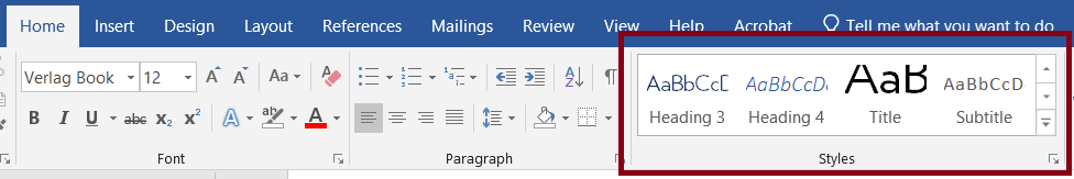
Below shows the location for Styles in Microsoft Word. You can modify the Microsoft Word styles to match your current or preferred styles.
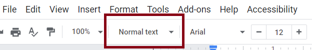
Blow shows the location of Styles in Google docs. You can set and change the default text styles in Google Docs.
Lists
Use the built-in numbered lists or bullet points to help users better comprehend material. Bulleted lists should be used to show a list of related items. Numbered lists should be used to show steps in a process or the number of parts to something.
Avoid using special characters, images or dashes to create a list.
Example List
Creamy Tomato Soup Recipe
- Add butter to a large pan and melt on medium heat.
- Add onion and garlic and cook until onion is soft.
- Add salt, pepper, oregano and paprika. Mix to combine.
- Dump in a can of tomato paste and a can of diced tomatoes. Stir to combine and let cook/simmer for about 3 minutes.
- Add chicken broth and stir well. Let the mixture simmer for about 4–5 minutes.
- Add heavy cream and stir to combine. Let the mixture simmer for a minute or two and then take off heat.
- Put soup into a blender or use an immersion blender to make it smooth.
- Serve hot with any bread of your choice.
Alignment
When creating a document, it is better to left-align your writing versus having it in justify. Justify creates inconsistencies in spacing between words and therefore, it makes it more difficult to read for all viewers.
Spacing
Most of us weren’t taught how to take full advantage of the formatting features in Microsoft Word and/or Google docs. Instead of pressing the enter button twice to create a space between a paragraph or image, it is best to use the line and paragraph spacing features. This will make your document easier to navigate for your screen reader users while still making the document look neat and orderly for everyone else.
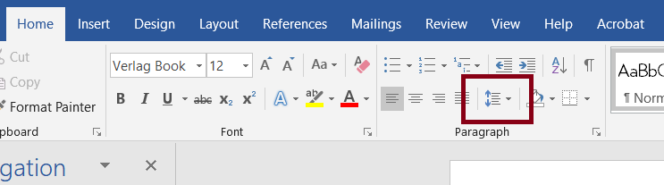
Below is an image of the location for paragraph settings in Microsoft Word.
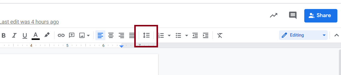
Below is an image of the location of paragraph setting in Google Docs.
In-line Objects
Make sure that objects are embedded in the flow of text. When you type, you want the image, chart or other material to push along as the text grows. You want your objects to be located in a meaningful place in the text so that the linear reading order of the object and text makes sense.
Color and Contrast
To ensure that your contrast between foreground and background is accessible, WCAG AA requires a contrast ratio of at least 4.5:1 for normal text (less than 18-point font) and 3:1 for large text (18-point or greater). If you are looking for a contrast checker, we recommend WebAIM Contrast Checker.
If you don't want to deal with a contrast checker, consider using the Web Accessible Hope Palette or try Color Safe to create your own accessible palette. Otherwise, feel free to keep things simple and just use black on white.
Table Structure
Whether you are creating a table in a web content management system or a document, there are tools for formatting your table to be accessible.
- Use tables to show data. Avoid using tables to create page layout. Even if you hide the borders visually, a screen reader will find them!
- Keep things simple. If possible, avoid tables with multiple header rows, merged cells or tables embedded in tables.
- Designate at least one row and/or column header for all tables.
- Add alt text to tables. Don't just repeat the same information in the description that appears in the heading above it. Describe the structure of the data. If your description is longer than a couple of sentences, consider putting the description in the main body of the text.
- Put something in every cell. If you leave a cell empty, it can be confusing to all viewers (not only for screen reader users).
- Repeat header rows at the top of each page if your table continues onto multiple pages in Microsoft Word. Avoid having a table splitting across multiple pages in Google Docs.
- Tables should never be an image or screen shot. If you cannot avoid it, make sure that you spell out the significance of the table.
You can learn more by downloading Example Tables (docx).
Images, Graphs and Charts
Alternative Text
Alternative text or “alt text” describes the content of pictures, graphs and charts in digital content. Alt text should be added to images in a way that conveys meaning for course materials, including Moodle, Word or Google Docs, Slides, etc.
Tips for writing alt text
- Use simple, precise language and keep the explanation brief.
- Typically, alt text should only be a sentence or two that describes the elements or the idea that you are trying to present to the viewer.
- Avoid redundant information that is in text near the image.
- Include information implied by the image, such as emotion or activity, and mention the layout if it is significant.
- Don't write “Image of”, “Photo of” or other things like that. A screen reader will add that by default. If the fact that an image is a photograph or illustration, or something else like that is important for understanding, it may be useful to include this in alternative text.
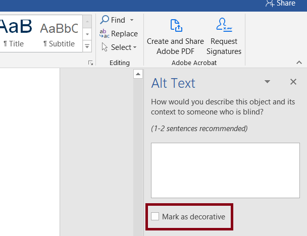
To add alt text to an image in Microsoft Word, right click on the image and select “Edit Alt Text.” If the image is decorative, you can check the box “Mark as decorative.”
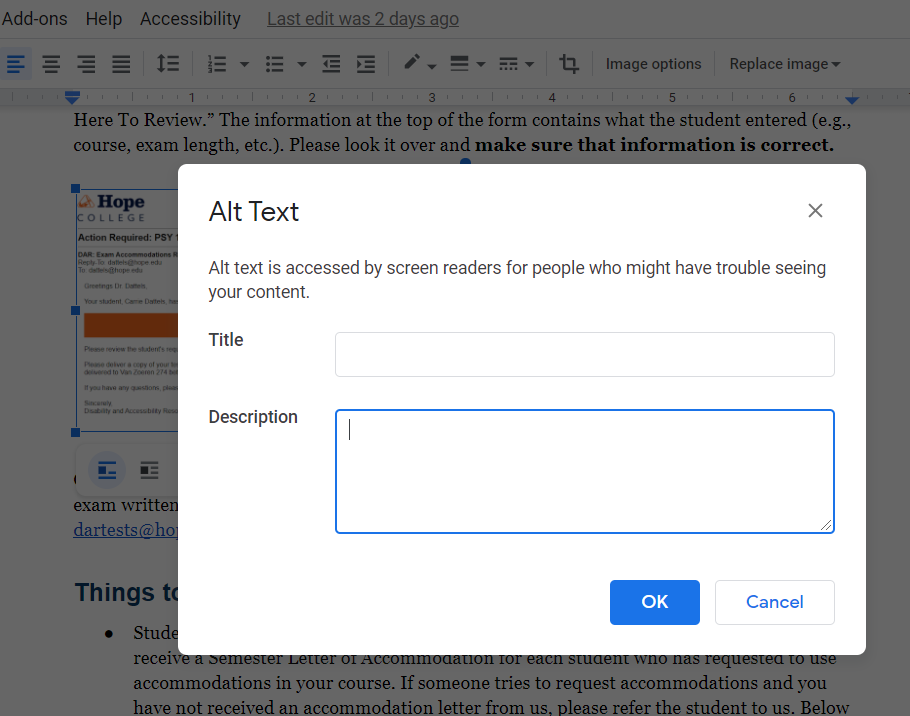
To add alt text to an image in a Google doc or slide, right click on the image and select “Alt Text.” Don’t worry about the title; just add your description. If the image is decorative, you can write “decorative” in the description box.
Scalable
It is important that your images, tables and graphs remain legible (clear and crisp) when zoomed or magnified. This makes your content viewable across devices (computer, tablet, smartphone) as well as usable for a student with low vision. Ideally, you want your text to remain legible when zoomed to 200%.
Run Accessibility Check
Once you have created your Microsoft Word or Google Docs document, consider running an accessibility check to make sure you didn't miss anything.
Microsoft Word has a built-in accessibility checker. Check Microsoft's support page on how to run the checker.
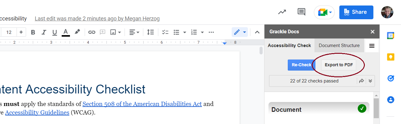
Google Docs doesn't have a built-in checker but if you have a Hope account, you have access to an add-on called Grackle Docs. Check out how to install Grackle Docs (YouTube) and how to use Grackle Docs.
If you run into any issue, please reach out to Computing and Information Technology (CIT) or let us know.
Sharing Documents
After you have created a document in Microsoft Word or Google Docs, try to avoid sharing it as a PDF. A PDF file’s main purpose is to preserve the formatting. Unfortunately, PDF files are often inaccessible. If they are not saved or created properly, screen readers and text-to-speech applications will not be able to read them.
So ask yourself, “Does this file need to be a PDF?” If the main purpose of your document is to be printed, then a PDF is appropriate. If not, why can’t you simply share the Word document?
Save Doc as PDF with Grackle
If you decide to export a Google Doc as a PDF, consider exporting with the Grackle Docs extension. It is free to use for all Hope College accounts. After you run an accessibility check and have fixed the errors, all you have to do is press the export button in the Grackle menu. This will make sure that all of the accessibility features are properly saved in the PDF (unlike if you downloaded the doc as a PDF directly from Google).
Acrobat Add-In for Word
If you have a compatible version of Acrobat on your computer, you will find a tab called Acrobat in Word, PowerPoint and Excel. Make sure that in the preferences that you have “Enable Accessibility and Reflow with tagged Adobe PDF” checked before creating the PDF.
“Save As” PDF in Word
You can use the “Save As” function in Office to create tagged PDF files without installing Acrobat. This will not be as clean as with the Adobe add-in, so use the add-in if you have it.
Never “Print” to PDF in any program. A screen reader user may still be able to access the text of a PDF created in this way, but you will lose heading structure, alt text and any other tagging.
Not finding what you came here for?
Van Zoeren Hall41 Graves PlaceRoom 261Holland, MI 49423
workP. 616.395.7925
dar@hope.edu